LAW ANGELS
Designing Law Angels: An SQE1 Preparation Platform
Senior Product Designer
WEB, MOBILE-RESPONSIVE

INTRODUCTION
Law Angels prepares people to qualify as solicitors in England and Wales. I was the sole UI/UX designer, working from first stakeholder conversations through research, IA, flows, wireframes, UI and handoff to supporting the build.

The exam shapes everything
Almost every decision in this product traces back to the mechanics of the assessment, so I started by learning it properly.
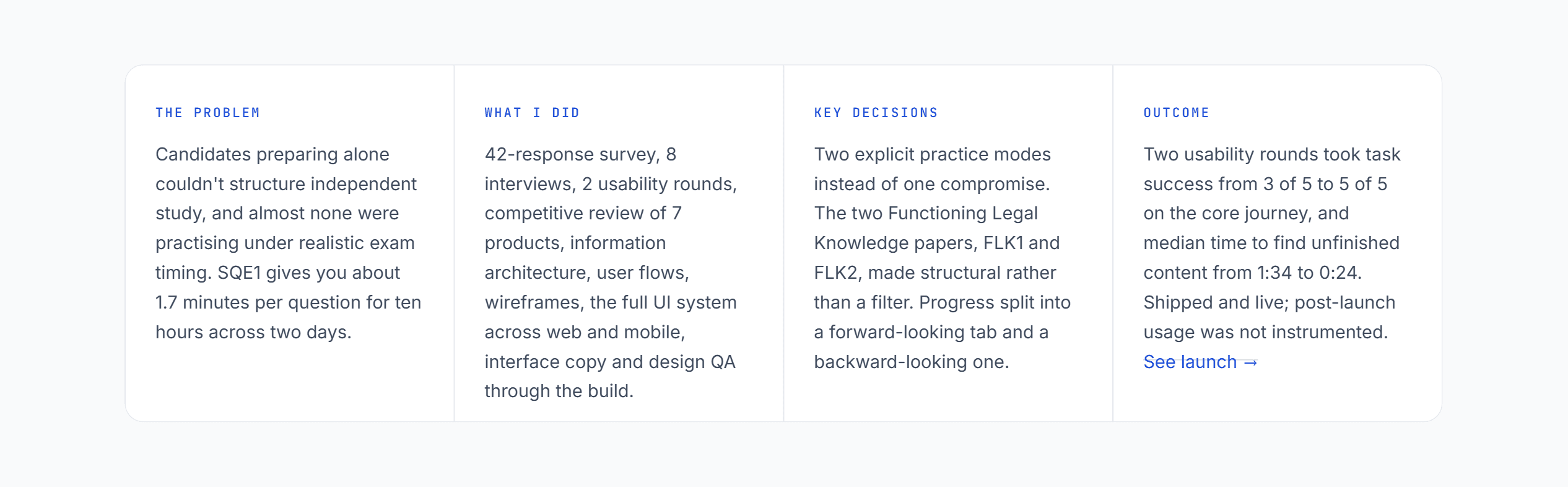
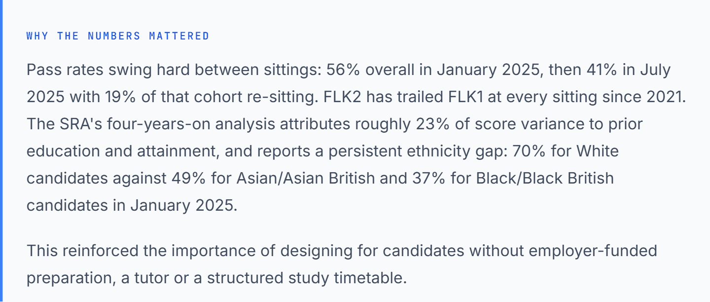
SQE1 is two assessments, each testing what the SRA calls Functioning Legal Knowledge. FLK1 covers business law and practice, dispute resolution, contract, tort, the legal system, and constitutional and administrative law. FLK2 covers property practice, wills and estates, solicitors' accounts, land law, trusts, and criminal law and practice. Each is 180 single-best-answer questions delivered in two sittings of 90 questions in 153 minutes. Ethics runs through both rather than sitting as its own paper.
That leaves roughly 1.7 minutes per question, across ten hours of examination, on scenario questions that often run a full paragraph. Pace isn't a nice-to-have skill here. It's most of the exam.

Four things going wrong
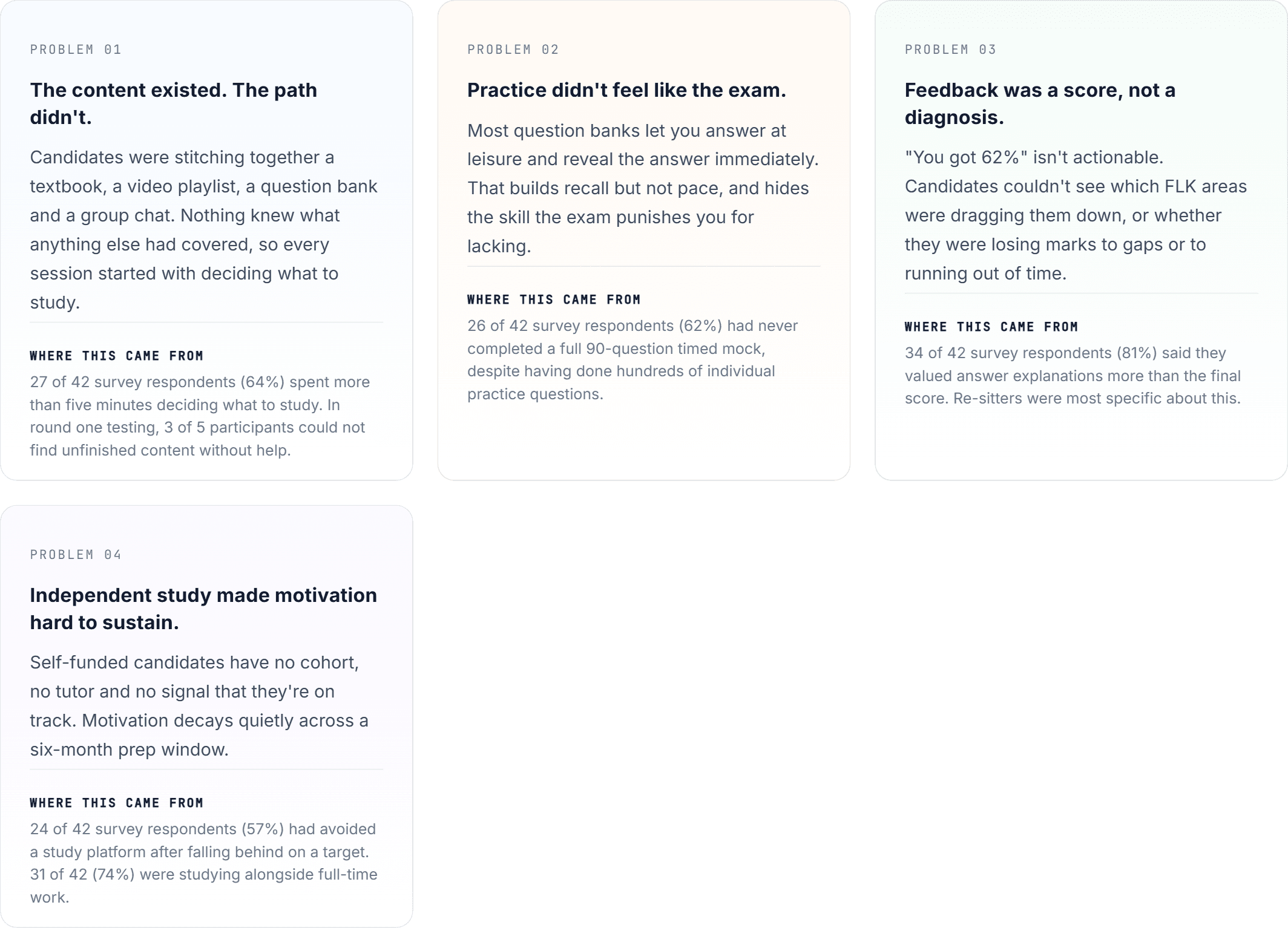
These four came out of the survey and interviews rather than out of a brief. Each card notes which part of the research it traces back to.
Who this is for
First-time and repeat SQE1 candidates preparing without an employer-funded course.
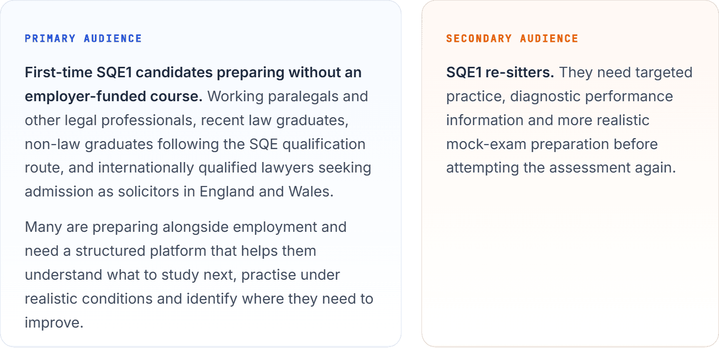
Many SQE candidates do not study within a conventional full-time classroom environment. They balance preparation with employment, commuting and other responsibilities, often funding the examination and preparation themselves. A fail costs roughly two thousand pounds and six months.
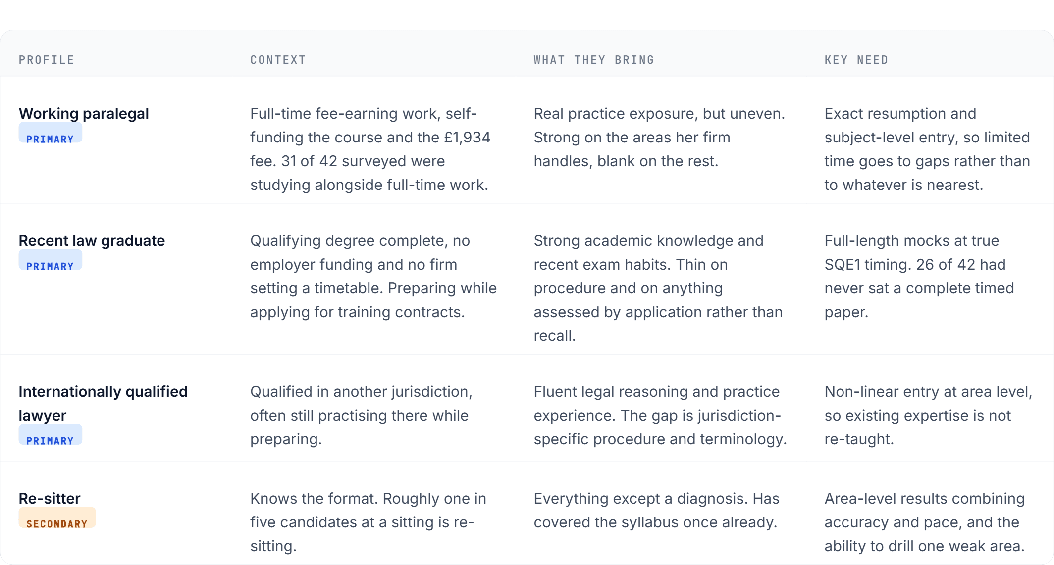
Four profiles came out of the research, separated by what a candidate already knows and how they fund their preparation rather than by background, because those were the two variables that changed what each one needed from the product.
How I worked out what to build
A mixed-method approach to understand how SQE1 candidates organised their study, where existing preparation tools were failing them, and what they needed from a single learning platform.

Approach
42 survey responses from current SQE1 candidates.
8 semi-structured candidate interviews.
2 rounds of usability testing with 5 participants in each round.
A competitive review of 7 exam-preparation and question-bank products.
Stakeholder interviews with the founder and legal content team.
A content audit covering 13 courses, 122 videos and thousands of practice questions and flashcards.
Sitting the SRA's published sample questions against a clock myself, to feel the time pressure rather than be told about it.
Participants were recruited through the founder's network, LinkedIn and online SQE study communities. The interview group included four first-time candidates, two re-sitters and two candidates from non-law academic backgrounds. Six of the eight were studying while working full time.
The survey gave me a broader view of recurring behaviours. The interviews explained why those behaviours were happening
Quantitative findings
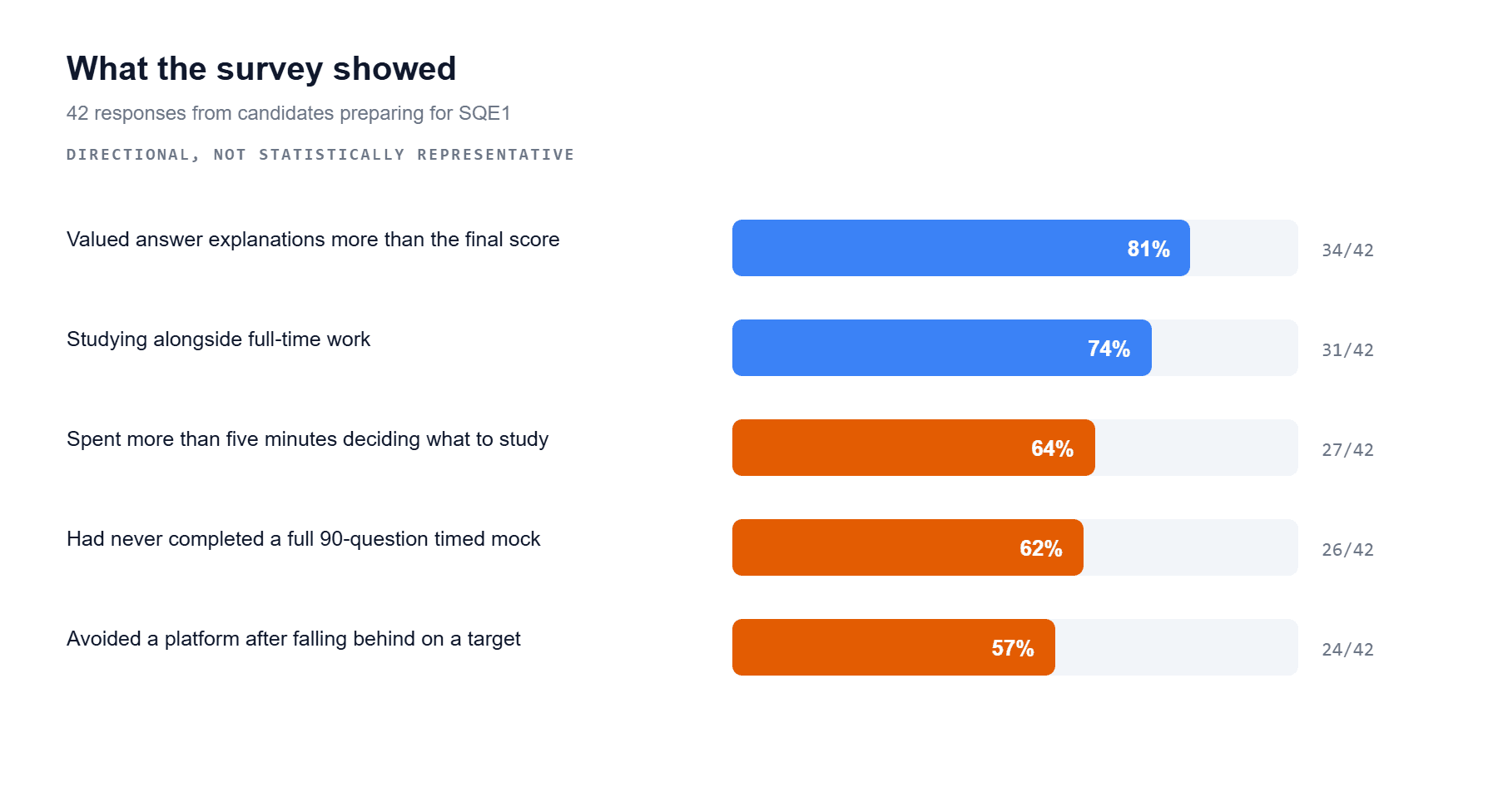
Five behaviours recurred across the survey.
Qualitative analysis
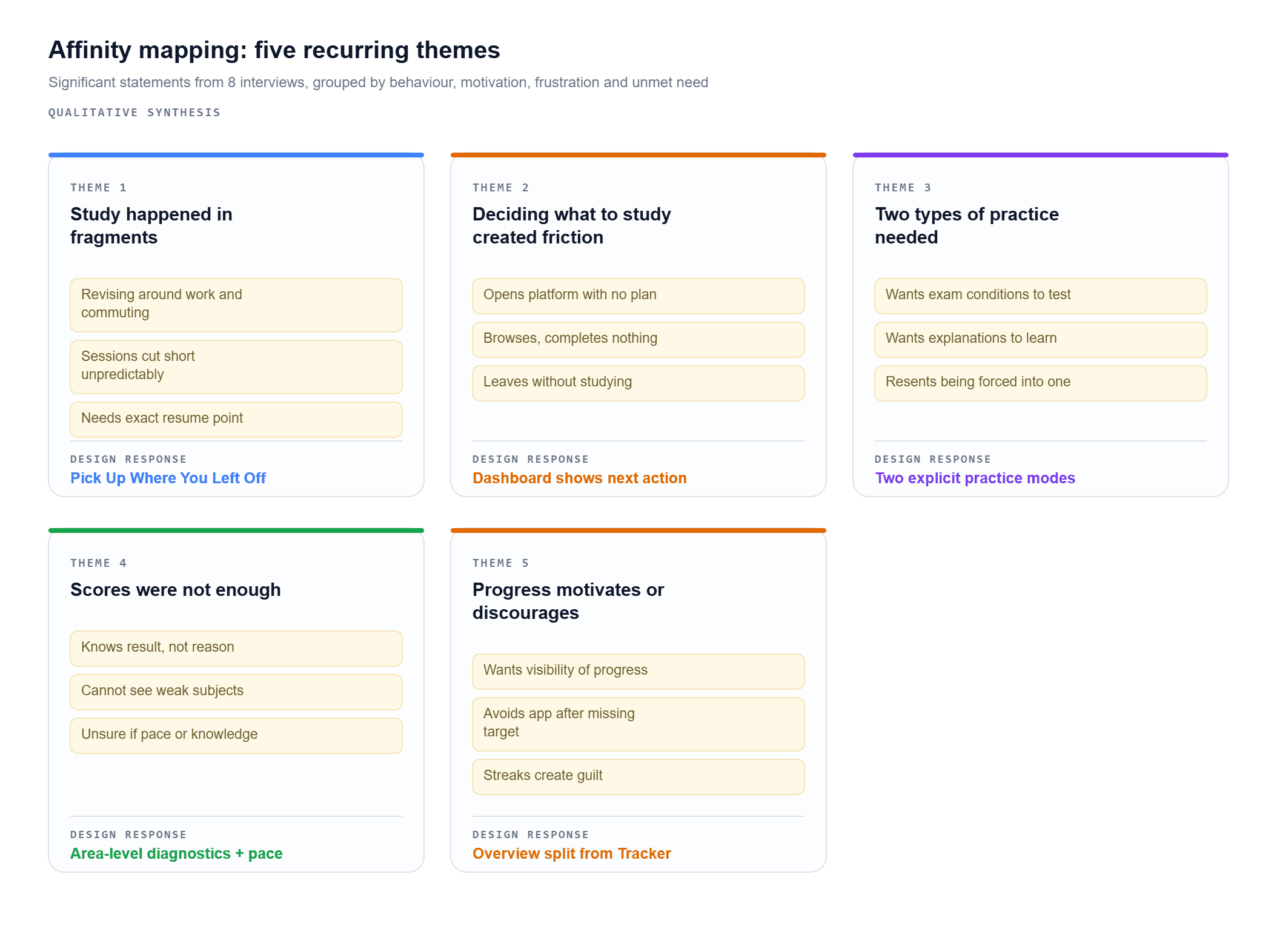
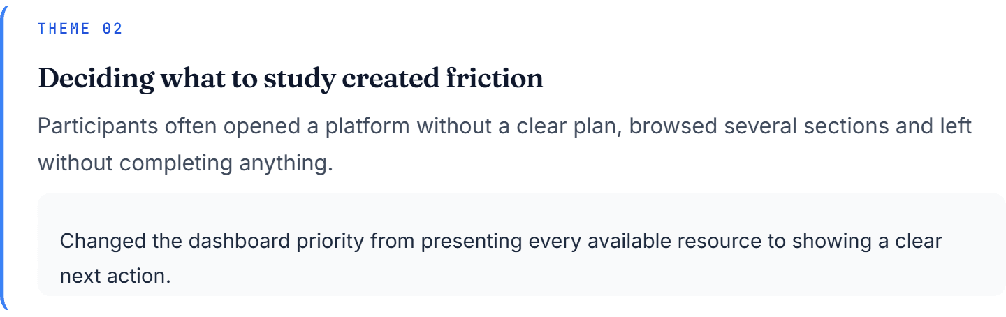
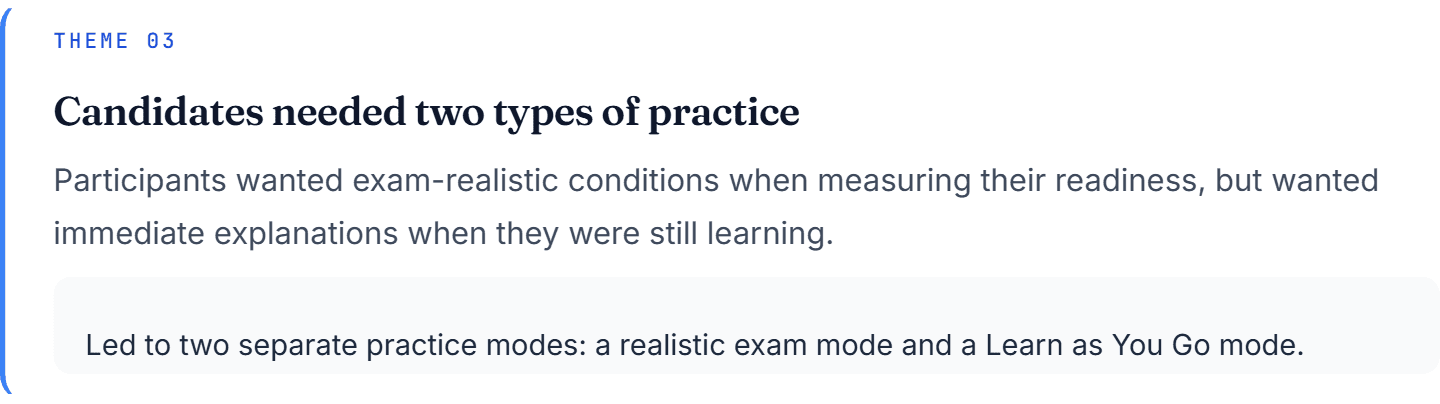
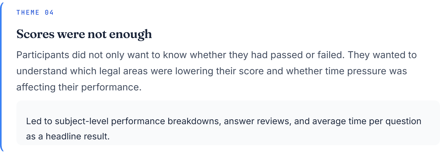
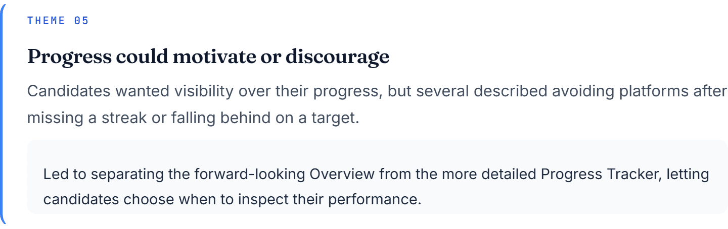
I recorded the interviews, extracted significant statements and grouped them through affinity mapping, organising observations by behaviour, motivation, frustration and unmet need. Five themes appeared repeatedly.
Affinity mapping. Each cluster carries the design response it produced, so the line from statement to feature is traceable.

Two rounds, ten participants
I tested the initial wireframes with five participants using four core tasks, redesigned against what failed, then tested the revised prototype with five more.
Find the next unfinished piece of course content.
Start an exam-realistic mock.
Choose a practice mode that provides immediate explanations.
Identify the subject area that most needed revision.
Round one
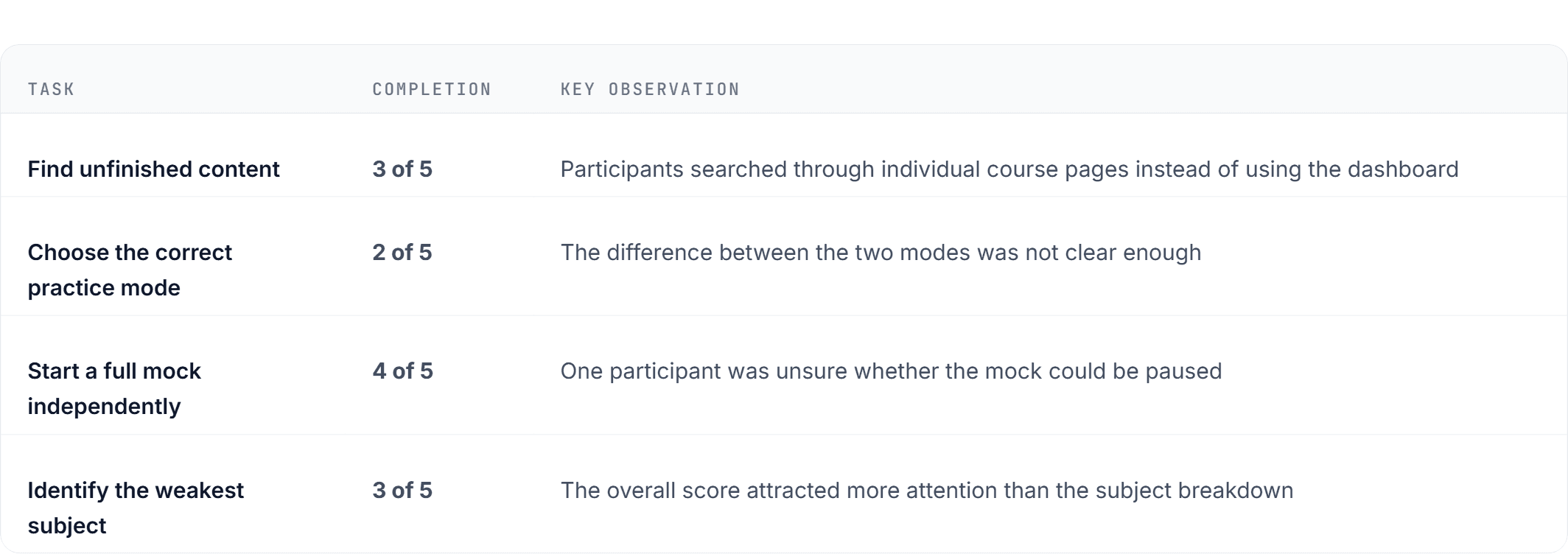
Median time to find unfinished content: 1 minute 34 seconds.
What I changed
Made the resume card more prominent on the dashboard.
Added clear descriptions of what each practice mode included and excluded.
Added a mock-exam brief before the mode selection screen.
Strengthened the hierarchy of subject-level performance results.
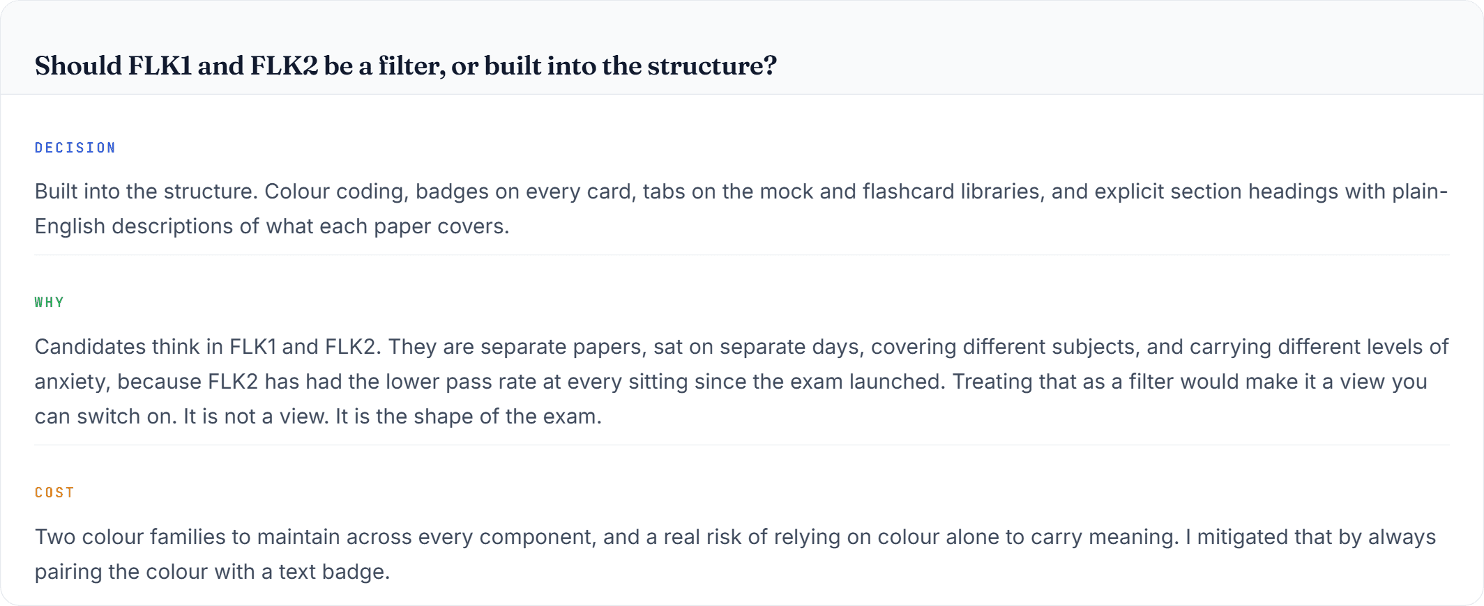
Used FLK1 and FLK2 as structural groupings throughout the product.
Moved the question map below the exam question to reduce distraction.
Round two



The Information Architecture
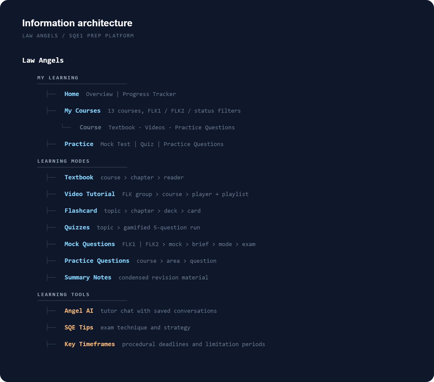
The sitemap. Three labelled groups rather than one list of eleven items.

Three journeys carried the weight
Taking a mock exam
The tension is realism against usability. A real sitting gives you no pause button and no explanations, but a tool that behaves exactly like the real exam is punishing on a Wednesday evening, and people won't start one. I resolved it by putting an explicit fork in the flow and being honest in the copy about what each side costs you.
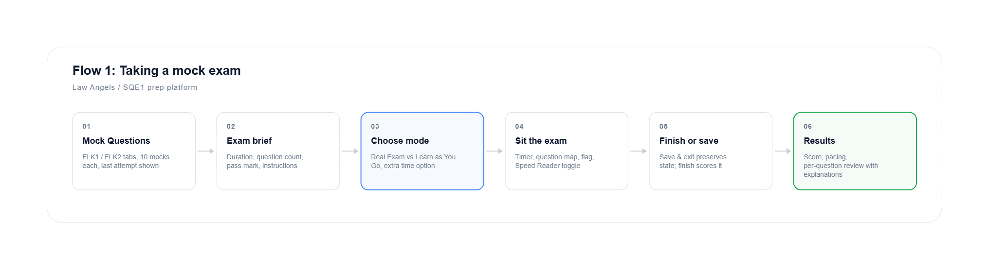
Flow 1. The fork at step 03 is the decision the whole feature hangs on.
Drilling a weak area
The re-sitter's flow. Get from "I'm bad at Constitutional Law" to a relevant question in as few steps as possible, with the boundaries of each area explicit so progress feels finite.
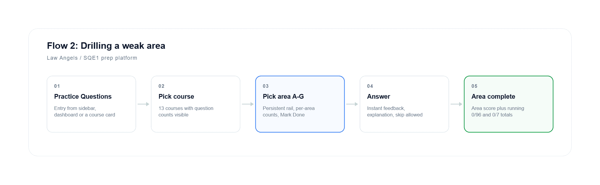
Flow 2. Per-area counts make the remaining work visible at every step.
Returning after a gap
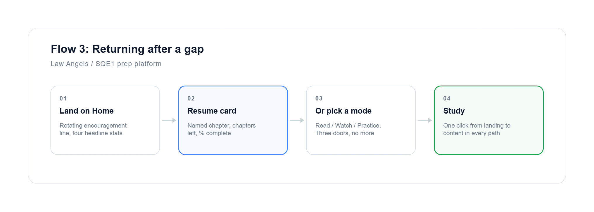
Flow 3. One click from landing to content on every path.
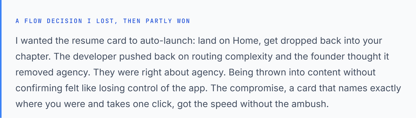
Structure before pixels
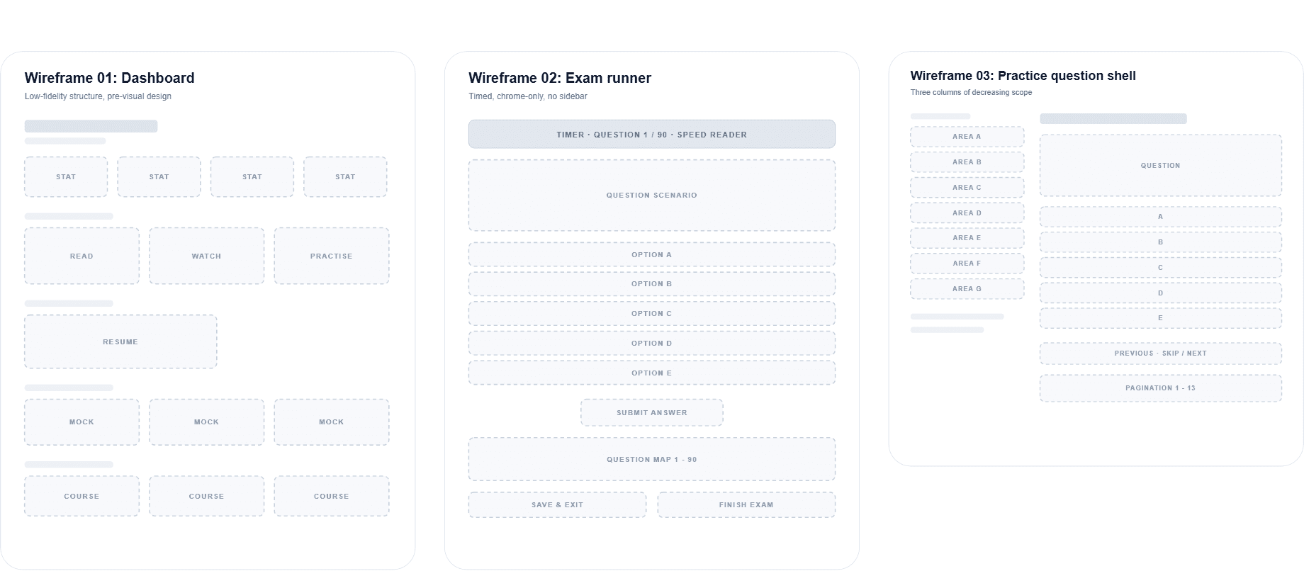
I wireframed three layouts. Everything else in the product is a variation on one of them, which was deliberate: fewer templates meant a faster build and a more predictable product.
What changed on the way to build
The dashboard lost a section. My first version had a recommendations module. We couldn't generate good recommendations at launch with no historical data, and a bad recommendation is worse than none. The space went to the resume card and the mock shelf.
The question map moved below the question. In the wireframe it sat in a right rail, where ninety circles compete with the thing you're meant to be reading.
Practice questions gained the persistent area rail so you can see your position in the whole course while answering.
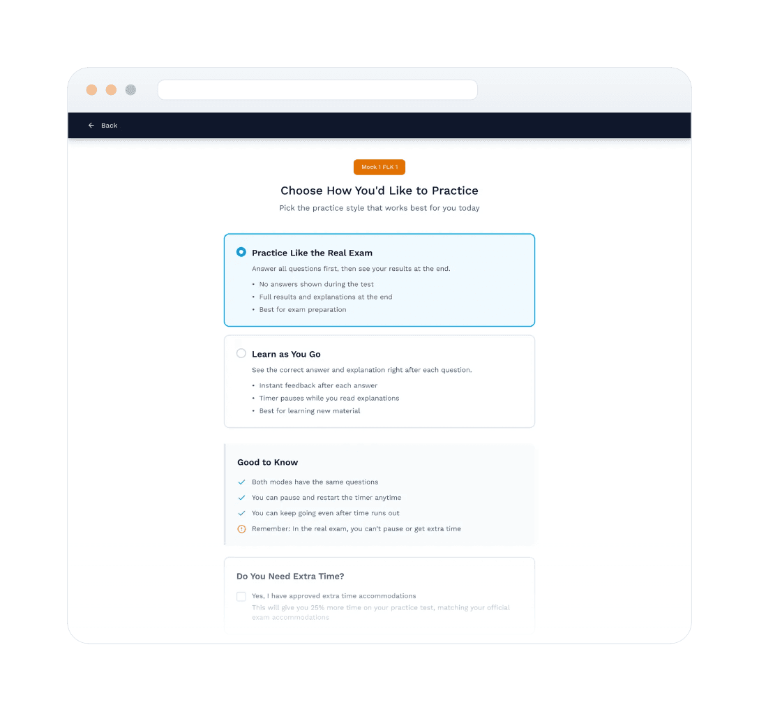
The mode-choice screen didn't exist at first. It came out of the interviews and became one of the most important screens in the product.
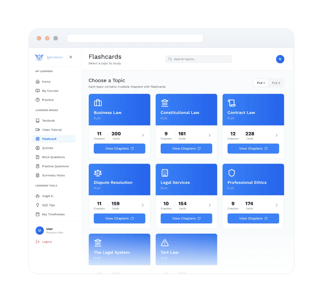
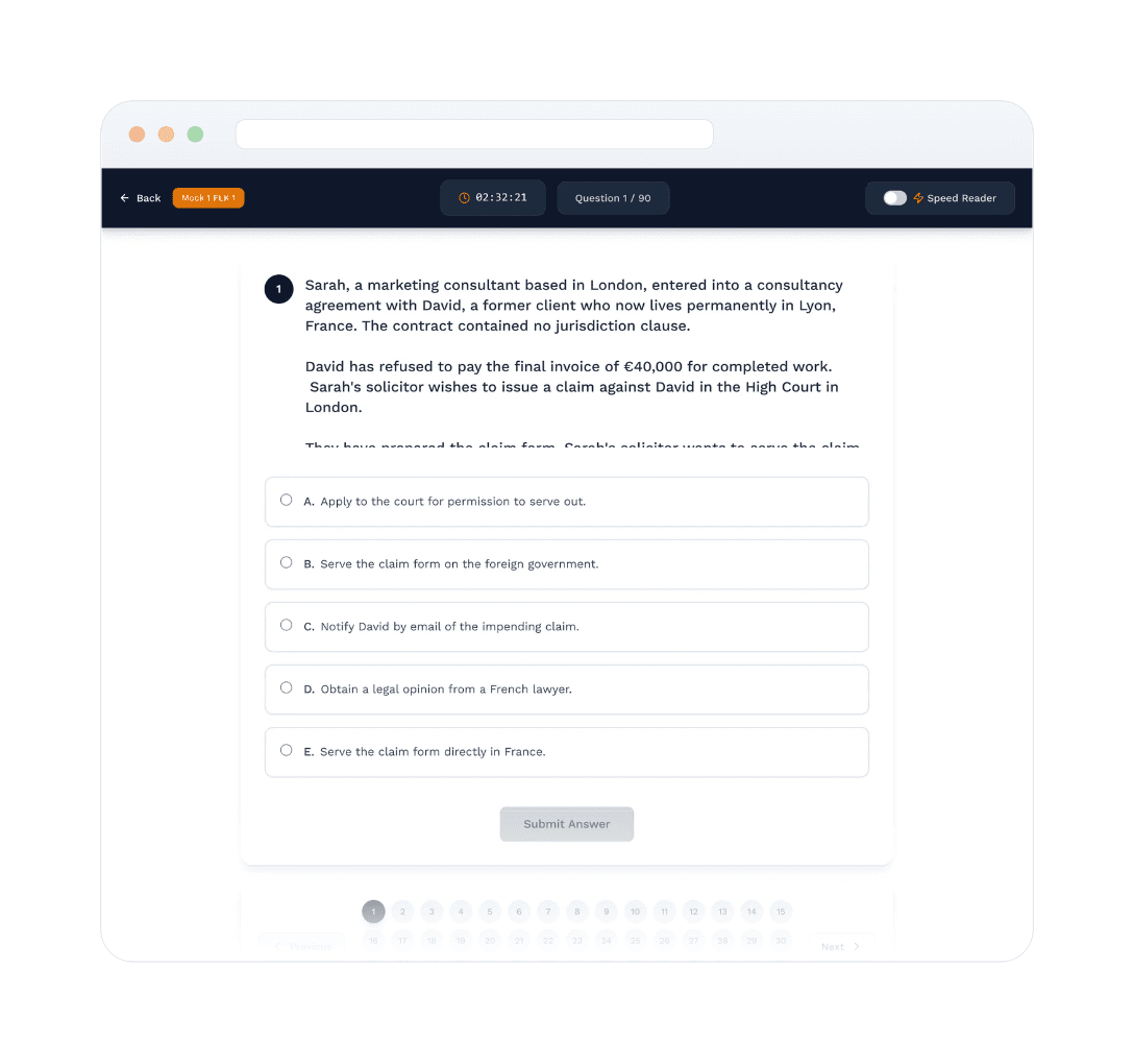
The mode fork. Two paths with three bullets each on what it costs you, plus the reminder that the real exam has no pause and no extra time.
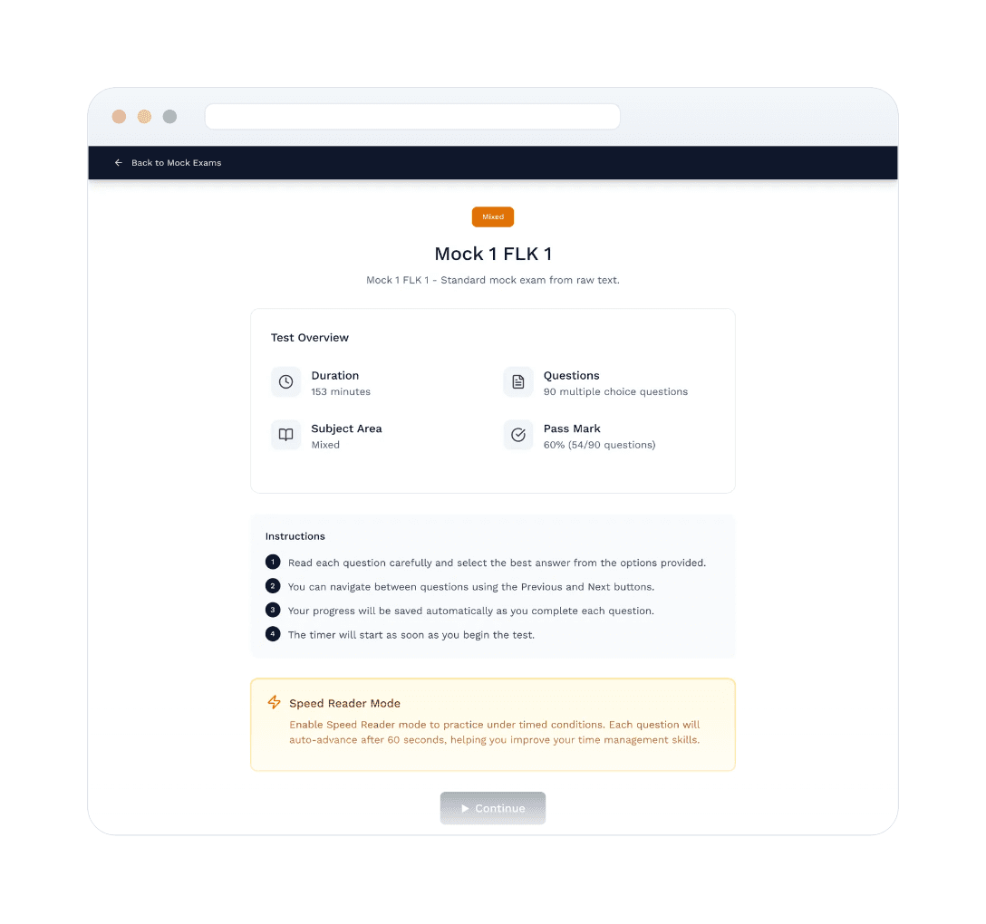
The exam brief. Enough to decide whether now is the right time. The closing line about uninterrupted time exists because an abandoned mock is worse than one not started.
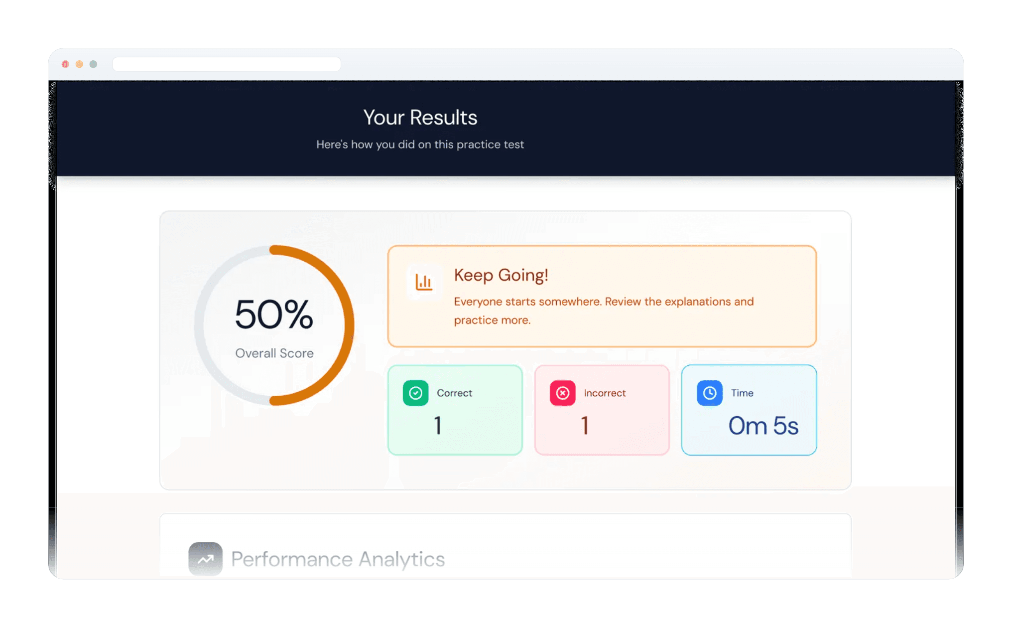
Results. Score, then accuracy rate, total time and average time per question labelled "pacing indicator", then a per-question review filterable to All / Wrong / Right. Time is reported as a metric of equal standing to accuracy, because in this exam it is one.
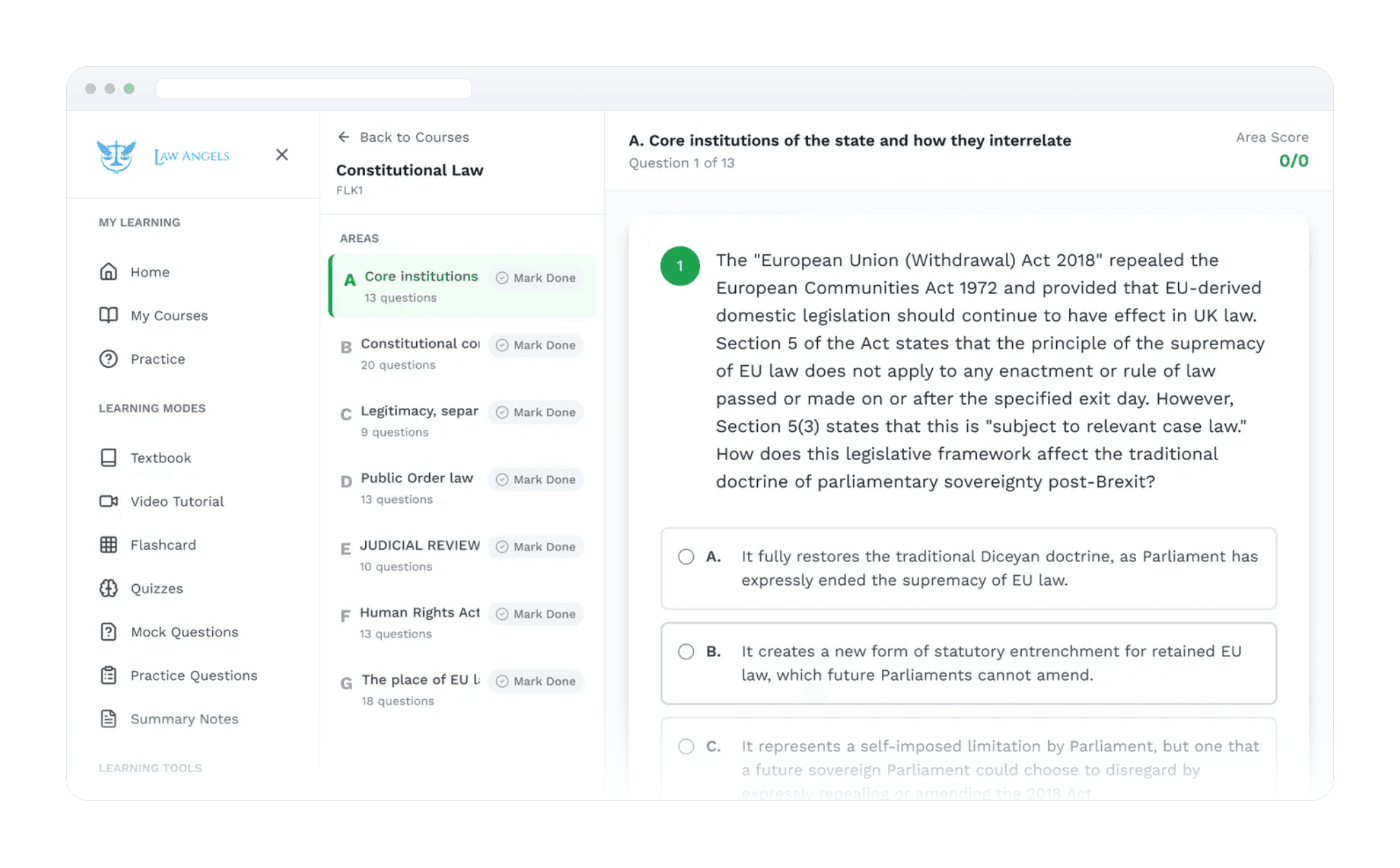
Practice questions. Three columns of decreasing scope, so you can re-orient at any level without leaving the screen.
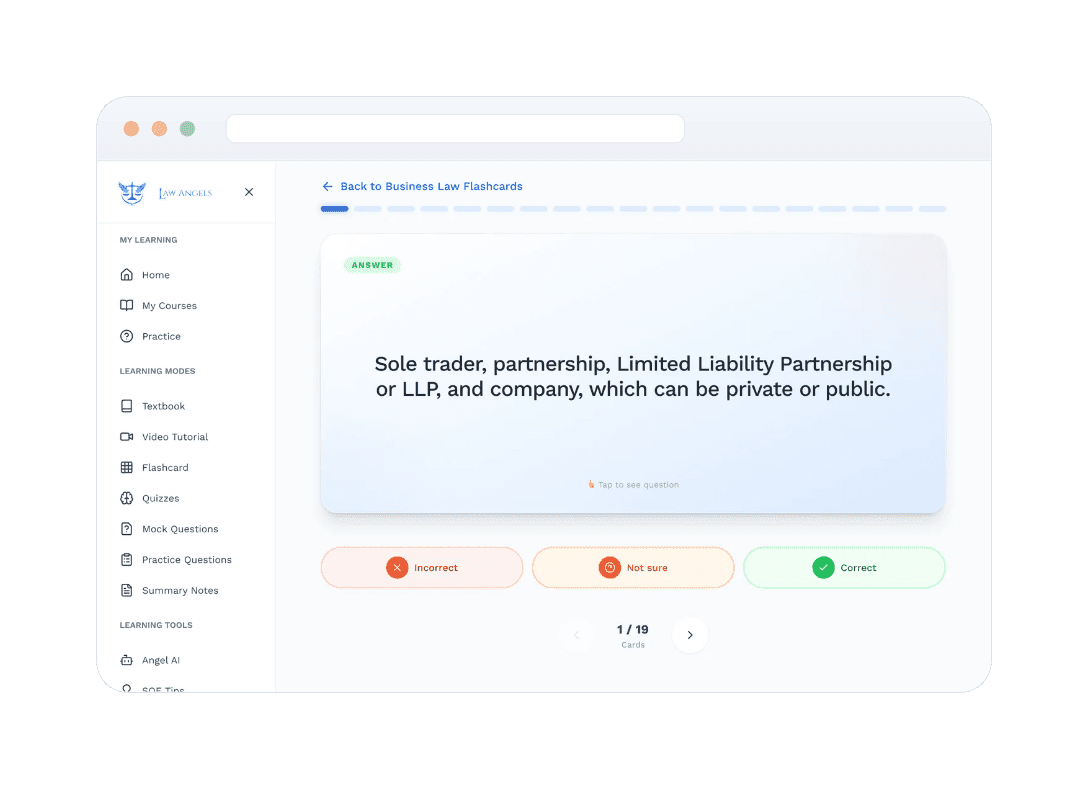
Flashcard, answer side. Three self-assessment states, colour-coded the same way as feedback everywhere else in the product.
Quiz round. Playful wrapper, identical question difficulty.

Angel AI, the tutor for people studying alone
Every other feature in this product assumes you already know what you are looking for. Angel AI exists for the moments when you do not.
Why it exists. The defining condition of this audience is isolation. Someone preparing without an employer-funded course has no classmates to ask, no tutor on call, and no supervising solicitor to interrupt. In the interviews, the recurring pattern was not people struggling with hard questions. It was people hesitating over basic ones. They would hit a term or a procedural step they did not understand, have nobody to ask, and either guess or lose twenty minutes to a search that returned an answer written for a different country's legal system. Angel AI is somewhere to ask the question you feel you should already know the answer to.
Where it sits, and why that is an argument. It lives under Learning Tools, alongside SQE Tips and Key Timeframes, rather than under Learning Modes with the textbook, videos and question banks. That placement is deliberate. It says the tutor is a companion to studying, not a replacement for it. Someone who spends their week talking to a chatbot instead of answering practice questions is not preparing for this exam, and the structure of the navigation makes that point before any wording has to.
How candidates use it. Three patterns came up. Questions in the middle of content, where something in a chapter did not land and they need it rephrased. Questions before starting, where they want the shape of a topic before reading about it. And questions after getting something wrong, where they understood the explanation but not the principle underneath it. Conversations are saved and searchable, so the same question does not get asked twice and a thread becomes revision material in its own right.
How it supports independent study. It answers from the platform's own course content rather than from anywhere on the internet, which keeps it inside the syllabus the candidate is actually being examined on. The tone is deliberately conversational, opening warmly before getting precise and citing case authorities such as Wingate v SRA where they apply. That was a considered choice: in testing, a formal institutional tone made people ask fewer questions, which defeats the entire point of the feature.

Why the two versions differ. On desktop the assumption is that you are already studying and want the tutor beside your work, so history stays visible and switching threads costs one click. On mobile the assumption is a single question asked in a gap, so it collapses to one thread and optimises for typing. Same feature. What changes is whether continuity or focus is the scarcer thing on that screen.
Progress tracking
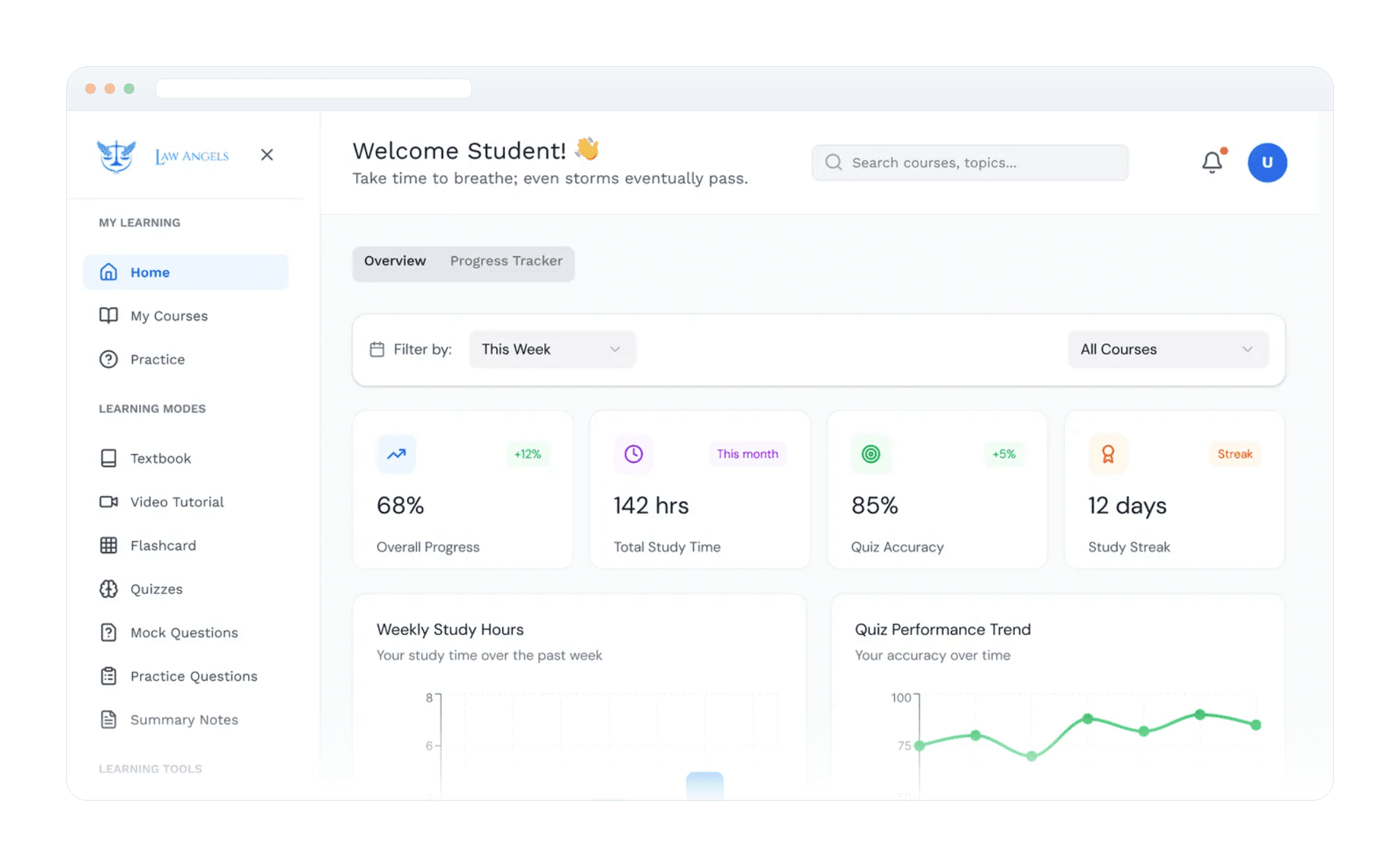
The dashboard has two tabs. Overview looks forward and tells you what to do next. Progress Tracker looks backward and shows study hours, an accuracy trend, completion by course, how your time splits across learning modes, and a named focus area.
Splitting them was a direct response to the guilt finding. Candidates told us they avoided platforms after falling behind. If a declining chart is the first thing you see when you open the app after a bad week, the app becomes a thing that makes you feel worse, and you stop opening it. Putting the performance data behind a tab means a candidate chooses when to look at it. That sounds minor. Across a six-month preparation window with a real risk of quiet abandonment, it is not.
The same thinking runs through the wording. A brand-new account does not show bare zeros, it says "Start your first exam". A 50% result says "Keep going, everyone starts somewhere". The greeting rotates through gentle encouragements. The founder wrote most of those, and they are better than mine.
The calls I had to defend
For each one: what I decided, why, and what it costs. Every design decision costs something, and saying so is more useful than pretending otherwise.


Smaller decisions

Designed for the gaps in a working day
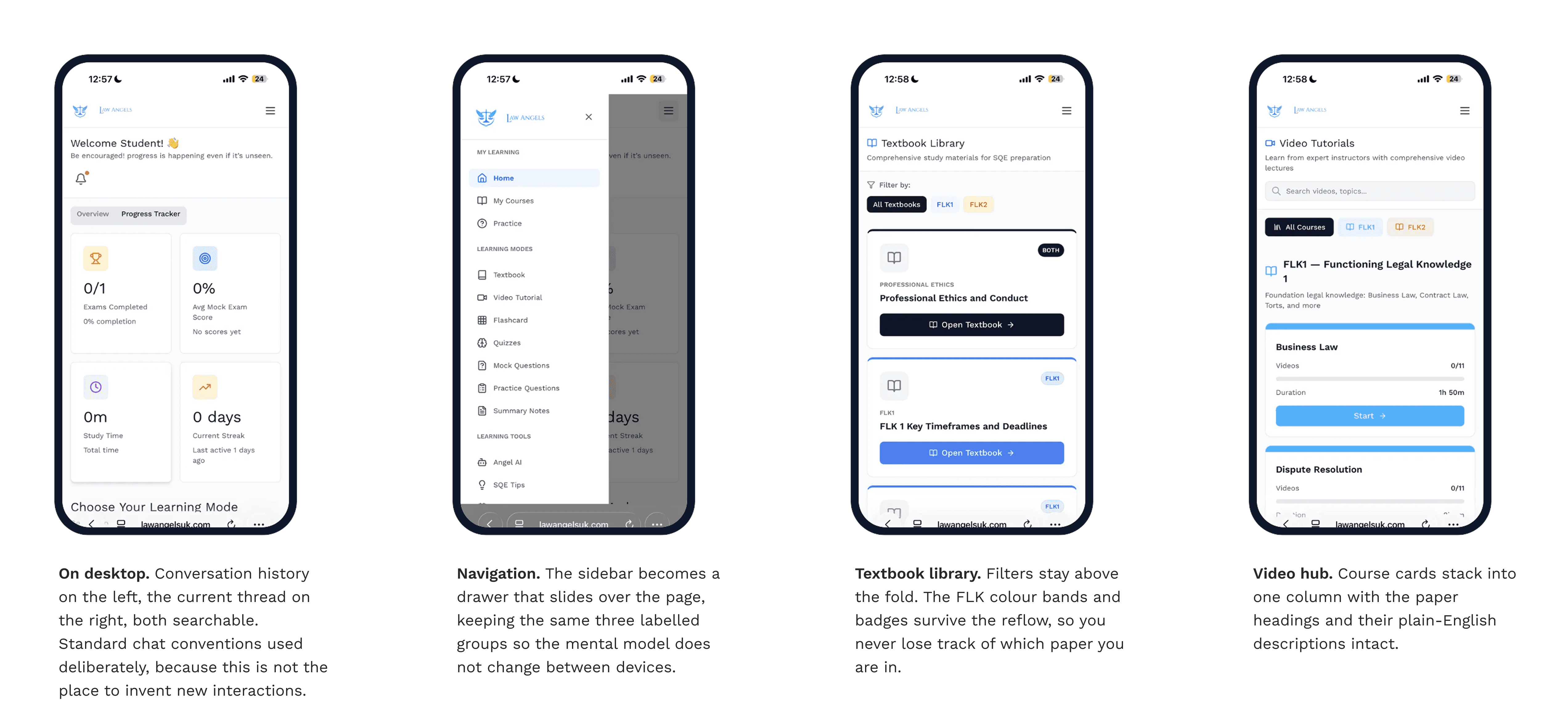
31 of the 42 candidates we surveyed were preparing alongside full-time work. For them, mobile is not a smaller version of the desktop product. It is where most of their studying actually happens.
The research made the split obvious. Nobody sits a 153-minute mock exam on a phone. But they do watch a chapter over lunch, run a five-question quiz while the kettle boils, and read summary notes on a train. So I designed mobile around the short-session activities, and made sure the long-session ones degraded honestly rather than pretending to work.
Every learning mode has a unit of work smaller than a full session, and on mobile that unit is the design brief. One video. One quiz round. One textbook chapter. One question. You should be able to open the app at a bus stop and finish something before the bus arrives.
How we worked
I was the only designer. Everything visual and everything to do with the experience came from me: the research, the information architecture, the flows, the wireframes, the interface, the design system, the interface wording, the handoff to engineering, and the design QA during the build.
Being the only designer did not mean working alone. The founder was in almost every design conversation, and the developer was involved early enough to change what I was drawing rather than just receiving it.

How we ran it
A weekly design review with the founder, showing work in progress rather than finished presentations. Showing rough work early meant correcting course in hours instead of sprints.
Flows before visuals, always. I would walk the founder and the developer through a flow diagram before showing a single designed screen. That moved arguments onto structure, where they are cheap to resolve, and away from aesthetics, where they are expensive and often unresolvable.
A named component library as shared vocabulary. Once the components had names, everyone used them. "That is a content card with a top band" is a much faster conversation than pointing at a rectangle, and it meant new screens could be built without me drawing every one.
Design QA on every build. I reviewed the staging site against the designs and logged the issues myself, rather than expecting pixel-perfect work from a specification. Faster, less adversarial, and I caught my own mistakes about as often as anyone else's.
What I handed overHandoff was a continuous conversation rather than a single event. What I actually delivered:
An annotated component library covering every state: default, hover, focus, active, disabled, loading, empty and error. States are where handoff usually falls apart.
Responsive specifications at three screen widths, with explicit rules for how each component reflows.
Interaction notes for anything involving time: what the timer does when paused, resumed or expired, how Speed Reader advances, and how a saved exam is restored.
Empty, loading and error states for every screen that depends on data. In a product where every new user sees a completely empty app, designing the empty states was not optional.
Copy decks, since I was writing most of the interface wording as part of the design.
What shipped, and what I can prove
We released in stages rather than all at once: courses and textbook first, then video, then practice questions and mock exams, then flashcards and quizzes, then Angel AI. Content and structure before assessment, assessment before the engagement features.
That meant the product was useful at every stage instead of only at the end. It also had a specific design consequence: every screen had to make sense with parts of the product missing. The dashboard's learning mode cards, the three routes on each course card, the grouped navigation, all of it had to hold up while half of it did not exist yet. In hindsight that pushed the architecture toward being more modular than it would have been if I had designed for one big launch.
How this should be measured
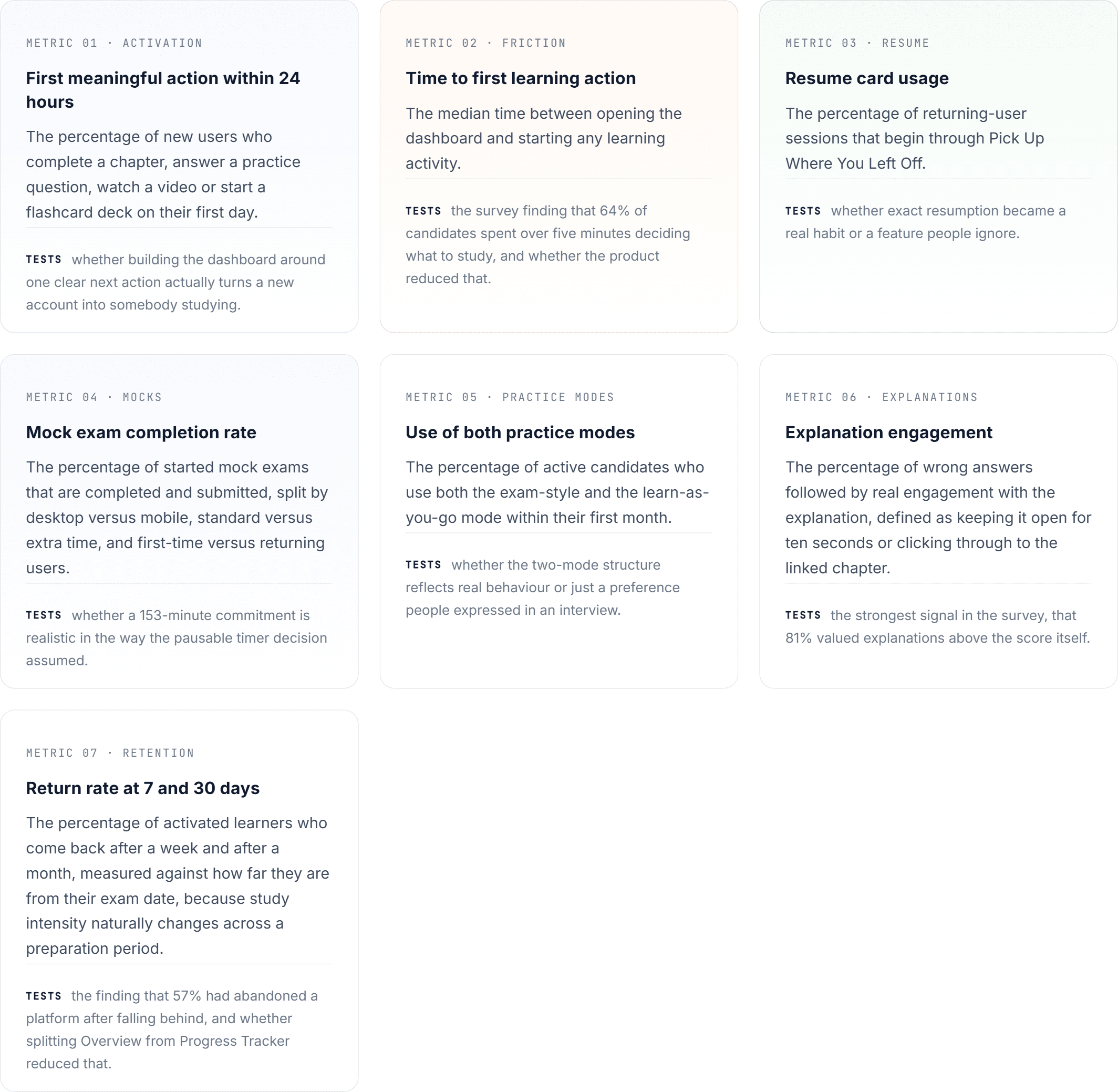
Each metric below tests whether a specific design decision solved the problem it was built for. That is the only reason to measure something.
What the research changed
The research did not simply confirm that candidates wanted more study material. It showed that the bigger problems were deciding what to do, practising under realistic conditions, and understanding what a score actually meant.

What I would do differently
What worked
Learning the exam before designing for it. Sitting timed sample questions myself produced more useful direction than anything else I did. Speed Reader, the 153-minute mocks and treating speed as a reported metric all came out of that afternoon.
Interviewing people who had used competing platforms. Specific comparisons beat general complaints, and that is where the sharpest findings came from.
Testing twice rather than once. The first round found four real problems. The second confirmed the fixes worked. One round would have told me what was broken without telling me whether I had fixed it.
Designing for guilt, not just for goals. Splitting Overview from Progress Tracker, and the tone of the empty and low-score states, is the most genuinely user-centred thing in the product.
What I would change
Set up analytics before launch. Top of the list. Three or four events would have turned this case study's hypotheses into findings.
Test the built product, not just the prototype. Both rounds ran on wireframes and a prototype. Once the real thing shipped, validation went back to informal walkthroughs. The tasks and success criteria already existed. I should have re-run them against production.
Audit accessibility rather than assume it. Measuring the palette while writing this case study found failures I should have caught during design.
Keep the rejected versions. I did not archive earlier iterations, so I cannot show the work behind the decisions. That is a habit, and I have changed it.
Build a proper first-run experience. The product explains itself screen by screen, but there is no guided introduction to the two papers and the different learning modes. A first-time candidate without a legal academic background still faces too much self-directed orientation in their first session.
Cut the dashboard back. Stats, learning modes, a daily goal, a pass rate, the next exam, the resume card, available exams and courses is too much even across two tabs. Three zones would do it: where you were, what is next, how you are doing
The bigger thing I learned
I came into this thinking the design problem was organising a large amount of content. It was not. The content was always going to be findable, because that is information architecture and it is a solvable problem.
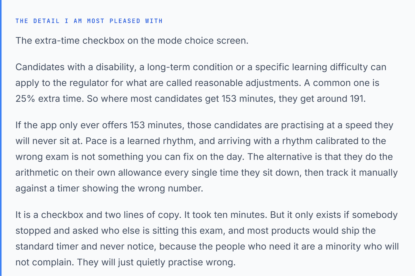
The real problem was emotional. These are people committing substantial money and time to a professional examination, usually while working full time and preparing without any employer support, for an exam whose pass rate has dropped as low as 41%. The decisions I am proudest of are not the clever ones. They are the extra-time checkbox, the "not sure" button, and keeping the declining chart on a tab you have to choose to open.
Designing for high-stakes learning means designing for somebody's relationship with their own progress, not just their access to the material. That is what I will take into the next one.